
Last Updated: October 30, 2026
Quick Summary
To match grout with tiles, first decide whether you want a seamless finish or a defined pattern, then choose a grout colour close to the tile for a calm, unified surface or a contrasting tone to make joints and tile shapes stand out. Always test a cured grout sample against your actual tile in the room’s real light before committing.
- Light grout makes a room feel larger and calmer but shows dirt sooner, especially on floors.
- Dark grout frames each tile, makes the layout feel deliberate and hides marks between cleans.
- On patterned tiles, pick a quiet tone from the pattern so the grout steps back.
- Spread mixed grout between tile offcuts, let it cure fully, then judge the colour.
- A wide joint reads stronger than a narrow one, so test the colour at your actual joint width.
Start With the Look You Want, Not the Colour Chart
Choosing grout starts with a decision, not a colour.
The colour chart comes second.
A common mistake is choosing a grout because it looks nice on a small plastic stick, then finding it fights the tile on the wall.
Two effects cover most projects:
- Seamless finish: grout close to the tile colour, so the eye reads one surface.
- Defined pattern: grout that contrasts, so joints and tile shapes stand out.
Neither is “correct”. They are different design goals. Daltile’s guide to choosing grout colour makes the same point: matching grout creates a cohesive look, while contrasting grout emphasises tile shape and layout.
So write down your goal first. Every choice after that gets easier.
Light or Dark Grout With Tiles: What Each Does to a Room
Light grout makes a room feel larger and calmer. Dark grout adds definition and hides marks better.
Light grout suits pale tiles and small bathrooms. It softens the grid and keeps the space bright and airy.
Dark grout does the opposite. It frames each tile, makes a layout feel deliberate, and hides staining between cleans.
A grey is often the practical middle. You can view a Magellan Grey epoxy grout colour pack to see a real grey option.
Watch out: choosing grout purely on trend, without checking it against your actual tile, is the most common regret we hear about.
Here is how light and dark grout compare on the effects that matter most.
| Grout tone | Effect on the room | Upkeep |
|---|---|---|
| Light | Makes a room feel larger and calmer; softens the grid | Shows dirt and grime sooner, especially on floors |
| Dark | Adds definition; frames each tile; makes layout feel deliberate | Hides marks and staining between cleans |
| Mid-grey | Softer contrast than black; defines layout without shouting | Practical middle ground |
Grout Colour for White Tiles: Match, Tone or Contrast
White tiles give you three good options, and each changes the room. Grout colour for white tiles can match for a seamless look, sit a shade darker for soft definition, or contrast hard for a bold grid.
- Match: white grout on white tile creates a clean, near-invisible joint. Good for a calm, spacious feel.
- Tone: a light grey or off-white adds subtle definition without a hard grid. Forgiving on marks.
- Contrast: dark grey or black grout turns white tile into a graphic pattern. Striking on a splashback or feature wall.
The catch with true white grout is upkeep. It shows every mark. If the surface gets heavy use, a slightly darker tone usually serves you better. Current grout options and their colours are listed on our website, where you can compare them against your tile sample.
Grout Colour for Patterned Tiles: Let the Pattern Lead
Patterned tiles already carry the visual interest, so the grout should step back.
Pull a warm neutral from the tile’s background, or match the lightest shade in the design. This lets the pattern lead while the joints stay calm.
A travertine-toned grout, for example, sits back behind warm patterned tiles without going stark. Check our website for the grout colours currently available, and test any option against your tile.
What most guides miss: on a busy pattern, a strong contrasting grout can turn the whole surface into visual noise.
Use Grout Colour Samples Before You Commit
Never choose grout from a chart alone. A grout colour sample tested against your actual tile, in your actual room, is the only reliable way to judge the result. Light changes everything, and so does the difference between wet and dry grout.
Here is a method we suggest, built around the two things that most often make a sample lie: drying and lighting.
Build a physical mock-up, not just a swatch comparison
- Get a physical grout sample or colour swatch, not a screen image.
- Place it against a loose tile, not a photo of one.
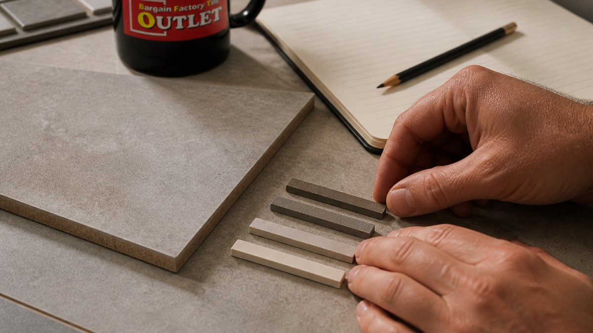
- Better still, spread a small amount of mixed grout into a joint between two offcuts of your actual tile on a scrap board. This is the only way to see the true joint width, texture and colour together.
- Let it cure fully. Cement-based grout typically dries lighter than it looks when wet, and the shift can be noticeable, a mid-grey can read almost pale once set. Judge the colour only after it has dried.
- View the mock-up in the room’s real light, by day and by night, and from a normal standing distance as well as close up.
- Compare two or three options side by side before deciding.
Read the sample under the light it will live in
A north-facing room and a south-facing room read colour differently, and warm artificial light at night can push a neutral grey towards brown or green. Check the mock-up under the light you actually use, not just the brightest window at midday. If the room has a mix of daylight and downlights, judge the sample under both.
Account for the joint, not just the colour
A wide joint shows more grout surface and reads stronger than a narrow one, so the same colour can look heavier in a wide joint than a tight one. If your layout uses wide joints, test at that width. If it uses narrow joints, test at that width. The colour on the stick is only half the story.
Screens mislead. The tile on your phone is not the tile on your wall, and a wet grout sample is not a dry one. A cured mock-up removes most of the guesswork.
Match Grout Type, Joint Width and Finish to the Tile
Colour is only part of the job. Grout type, joint width and finish all affect how the finished surface looks and performs, and they must suit the tile you have chosen. Two grouts in the same nominal colour can look quite different once installed, because the type and the joint geometry change how much light the grout catches and how much surface is visible.
Grout type changes the look, not just the performance
- Cement-based grout is common and easy to work with. It has a slightly matt, granular surface that softens the joint line and can make a colour read a touch lighter or chalkier once cured. It is porous unless sealed, so it stains more readily in wet areas and on floors.
- Epoxy grout resists staining and suits busy or wet areas. Its surface is typically smoother and denser, so a colour can read slightly deeper or more uniform than the same colour in cement grout. It is less forgiving to apply and generally costs more.
- Other systems exist for specific tiles and locations. Follow the tile and grout manufacturer’s guidance rather than assuming one type suits every surface.
Joint width changes how strong the colour reads
A wide joint exposes more grout surface, so the colour reads stronger and the grid becomes more visible. A narrow joint hides more of the grout, so the tile dominates and the colour reads softer. Narrow joints suit rectified tiles with tight, even edges; wider joints suit pressed-edge tiles and natural stone, where slight edge variation needs room. Always follow the tile maker’s guidance on minimum joint width, going tighter than specified can cause problems later.
Finish and texture matter on polished and textured tiles
- Sanded grout suits wider joints and helps fill them evenly.
- Unsanded grout suits fine joints and polished surfaces, where a gritty grout could scratch.
- Textured and patterned tiles can trap grout on the surface, so clean as you go and check the manufacturer’s advice for that tile.
Tile material changes the advice
Natural stone and some porous tiles need specific grout and sealing advice from the manufacturer, and real stone does not behave like a porcelain look-alike. Porcelain and ceramic are more forgiving, but the joint width and grout type still need to suit the tile. Our guide on how to choose and apply tile adhesive covers the adhesive side in more detail.
If any of this is unclear for your tile, check the manufacturer’s instructions or ask a qualified tiler. Suitability depends on the product and the location.
Plan for Cleaning, Staining and Long-Term Care
Grout choice is also a maintenance decision. Lighter grout and cement-based grout show staining sooner, especially in wet areas and on floors. Darker grout and epoxy grout hide marks and clean up more easily.
- Seal porous grout and natural stone as the manufacturer advises.
- Clean spills quickly, before they set.
- Use a neutral cleaner rather than harsh acids on cement grout.
- Expect discolouration over time in high-traffic zones, whatever you choose.
If staining worries you, a dark epoxy grout is a practical option. It hides marks better and resists staining in busy areas.
Bring Your Tile and Grout Questions to Our Campbelltown Showroom
The best way to settle a grout choice is to see it against your tile in person. Bring a tile sample, or pick your tile first, and compare grout options side by side under real light.
You can browse tiles and accessories online, then visit the showroom to check colours and specifications. Prices, stock and delivery terms are always confirmed on the current website. Suitability for wet areas and outdoor use depends on the product and your project, so ask us or a qualified professional.
Frequently Asked Questions
Is it okay to use grout the same colour as my tile?
Yes. Matching grout with tiles is a common choice when you want a seamless finish that lets the tile surface dominate. It works especially well with large-format porcelain and stone-look tiles where visible grout lines would break up the pattern. Keep in mind that a close match can make individual tiles harder to distinguish, so layout mistakes are less forgiving. Test a sample first, because grout often dries lighter or darker than the swatch suggests.
Should grout be lighter or darker than the tile?
There is no fixed rule. A slightly lighter grout can soften the look of dark tiles and make a space feel brighter, while a darker grout adds definition and hides marks better on light floors. The right choice depends on the effect you want and how much maintenance you are prepared for. Compare both options on a test board in the actual room lighting before deciding.
Does grout colour change as it dries?
Yes. Most grout looks darker when wet and dries to a lighter, more powdery tone, and some products can vary slightly from the chart. That is why a physical sample board is more reliable than a colour card alone. Apply the grout between a few offcut tiles, let it cure fully, then view it in daylight and artificial light before committing to the whole project.
Can contrasting grout make a room look smaller?
A strong contrast can make a grid of grout lines more noticeable, which may feel busier in a small room. If space is tight, a grout close to the tile colour usually gives a calmer, more open impression. That said, contrast can also highlight a feature wall or patterned tile. Test the effect on a sample board and judge it in the room rather than on a chart.
Matching grout to tile is a decision you make once and live with, so it is worth getting right before you commit. If you are weighing up colours and types for a kitchen, bathroom or outdoor project, Bargain Factory Tile Outlet can help you compare options in person. Browse our range of tiles, grouts and tiling accessories online, or visit the Campbelltown showroom to check colour packs against your tile and confirm current specifications before you buy.