
Last Updated: 1 November 2026
Quick Summary
To choose splashback tile colours, match them to your cabinets, benchtop and light rather than following trends. Let one surface lead and the other support it, and check undertones so warm and cool neutrals don’t clash. Always test real samples at home before buying.
- Let one surface lead: a busy benchtop suits a plain, low-contrast tile.
- Check undertones on a white sheet in daylight to avoid warm-cool clashes.
- In white kitchens, match the tile to the cabinet rather than the benchtop.
- Small kitchens suit light, glossy tiles and horizontal subway layouts.
- Matching grout to tile blends the wall; contrasting grout highlights the pattern.
Start With the Room, Not the Tile
The right splashback tile colour is the one that works with your cabinets, benchtop and light, not the one trending on social media. Renovators often arrive with a photo saved to their phone and no plan for how it will sit against their actual kitchen. That is where the trouble starts.
Colour choice is really a matching exercise. You are balancing three big surfaces: cabinets, benchtops and the splashback itself. Get that balance right and the kitchen feels calm. Get it wrong and even expensive tiles look off.
Start by answering three questions:
- What colour are your cabinets, and are they warm or cool in tone?
- What is your benchtop made of, and does it have a pattern?
- How much natural light does the kitchen get?
If space is tight, layout matters as much as colour. Our guide on how to choose the best tile types for small bathrooms covers the same size-versus-style thinking, and it applies to kitchens too.
How to Match Splashback Tiles With Benchtops
Matching splashback tiles with benchtops comes down to one rule: let one surface lead and the other support it. If your benchtop has a strong vein or pattern, choose a quieter splashback. If the benchtop is plain, the splashback can carry more visual interest.
Here is how the common pairings work in practice:
- Busy stone benchtop: pick a plain, low-contrast tile in a similar tone.
- Plain benchtop: a textured or patterned tile adds depth without clutter.
- Dark benchtop: a lighter splashback keeps the room from feeling heavy.
- Light benchtop: a deeper tile grounds the scheme.
Read the undertones before you read the colour
The pairing that fails most often is not a colour clash but an undertone clash. A cool grey benchtop next to a warm cream tile can look slightly dirty, even when both are lovely on their own. Undertone is the subtle cast beneath the surface colour, and it decides whether two neutrals sit comfortably together.
A simple way to check:
- Put the benchtop offcut and the tile sample side by side on a white sheet of paper in daylight.
- Ask which one looks warmer. Warm undertones lean yellow, cream, beige or terracotta; cool undertones lean blue, grey or green.
- If one reads clearly warm and the other clearly cool, expect tension. If both sit in the same family, the pairing is likely to hold.
- Repeat with the cabinet door. You want the splashback to agree with at least one of the two larger surfaces, not fight both.
Natural stone benchtops vary from slab to slab, so always match against the actual slab or an offcut rather than a showroom display. Porcelain look-alikes are more consistent, but their printed pattern can still carry a warm or cool cast that only shows under your kitchen light.
Bedrosians kitchen tile trends guide reports that 96% of respondents named neutrals as the most popular colour family, with greens at 86% and blues at 78%. That tells you neutral splashback tile colours are a safe starting point, but safe is not the same as right for your room, a neutral in the wrong undertone is still a mismatch.
Splashback Tiles for White Kitchens
White kitchens give you the most freedom, and that is exactly why people freeze. A white cabinet and white benchtop leave the splashback as the one place to add personality or keep things serene.
For a calm, seamless look, match the tile close to the cabinet white. For a bit more depth, step down to soft grey, beige or cream. To make a statement, a bold colour or a patterned tile becomes the focal point.
A few directions that hold up well:
- Soft grey subway tile for a clean, modern finish.
- Warm beige or cream to soften a stark white room.
- Green or blue for contrast that still feels grounded.
- Textured white for interest without adding colour.
Browse our wall tiles to see the range of finishes that suit a white kitchen before you settle on a shade.
Why white-on-white is the hardest scheme to get right
White is not one colour. A bright cool white cabinet, a warm white benchtop and a pure white tile can each look correct on their own and then read as three different whites once installed. The eye notices the mismatch even when no one can name it.
Before committing, test the scheme the way you would test any colour:
- Take real tile samples home, not just photos.
- View them at different times of day, in morning and evening light.
- Hold them against your actual cabinet and benchtop samples.
- Check them under your kitchen lighting, not just daylight.
- Live with the samples for a few days before deciding.
Lighting changes perceived colour. A tile that looks warm and creamy online can read cold and clinical under cool-white downlights, and a crisp white can turn creamy under warm bulbs. This is why a white splashback chosen from a screen is one of the most common sources of regret. Understanding how these shifts occur requires a grasp of the principles of colour theory, which remain just as essential when coordinating your wardrobe as they are when balancing the light and pigment in your kitchen.
If you want a seamless white kitchen, match the tile to the cabinet rather than the benchtop. The cabinet is the larger, more visible surface, and the benchtop can carry a slight difference without drawing the eye.
If you would rather add depth than chase a perfect white match, a soft grey or warm beige tile is more forgiving and easier to coordinate with grout. Keep the grout close to the tile colour so the wall reads as one calm surface, and check the finished look against your cabinet sample before you order.
Small Kitchen Splashback Tile Ideas
Small kitchens reward light colours and simple patterns. Lighter splashback tile colours bounce light around and make the space feel bigger. Busy, high-contrast patterns can chop up a small wall and make it feel cramped.
Practical ideas for a compact kitchen:
- Light, glossy tiles to reflect light and lift the room.
- Horizontal subway layouts to draw the eye along the wall.
- A single accent band instead of a full patterned wall.
- Mosaic or small-format tiles for a detailed look on a short run.
If you like the mosaic route, mosaic tiles can give a fine, detailed finish without overwhelming a small space. Keep the grout close to the tile colour so the wall reads as one calm surface.
Splashback Tile and Grout Colour Combinations
Grout is the most overlooked part of splashback tile colours, and it changes the finished look more than most people expect. Matching grout to the tile blends the surface. Contrasting grout makes the tile shape the star.
Three combinations that work:
- Tile and grout matched: a smooth, seamless wall.
- Light tile, darker grout: highlights the pattern and grid.
- Dark tile, light grout: a bolder, more graphic look.
For a step-by-step method, our guide on matching grout with your tiles walks through the process.
Lighter grout can show marks sooner in a cooking zone, so consider how easily it will be cleaned before you choose.
Tile Club’s 2026 kitchen tile trends notes that blue tones are increasingly requested for splashbacks. Blue with a soft white grout is a good example of contrast done with restraint.
Test Splashback Tile Colours Before You Buy
Never choose a splashback tile colour from a screen alone. Lighting changes perceived colour, and a tile that looks warm online can read cold under your kitchen downlights.
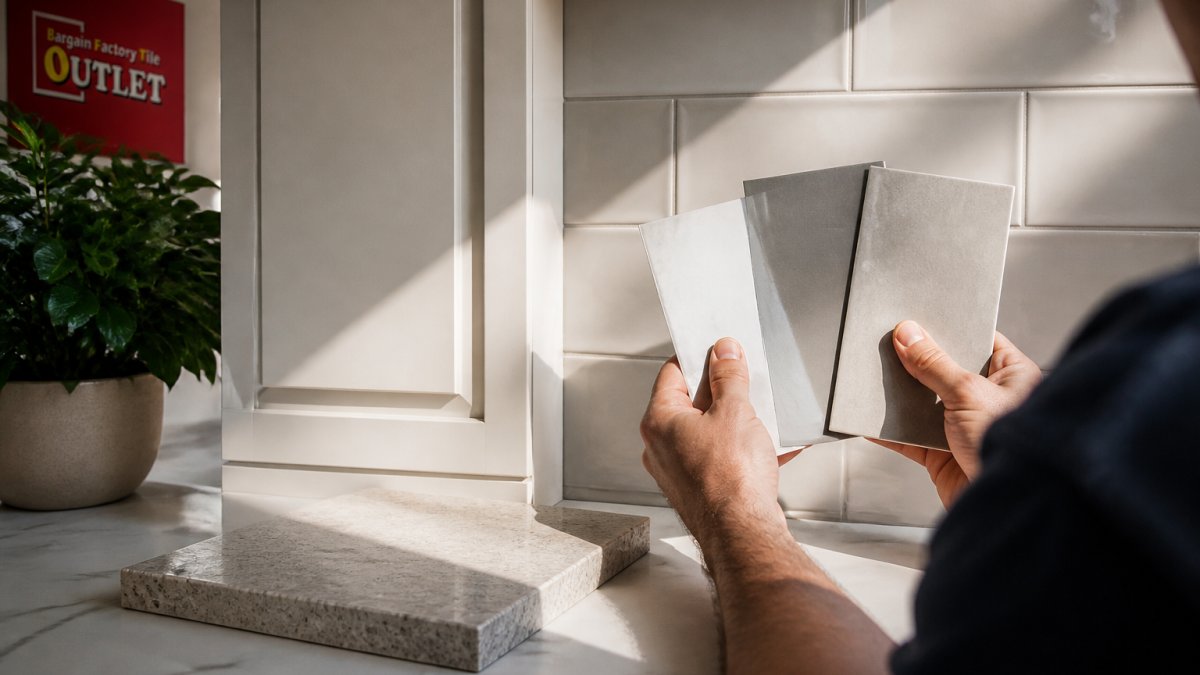
Use this simple testing method:
- Take real tile samples home, not just photos.
- View them at different times of day, in morning and evening light.
- Hold them against your actual cabinet and benchtop samples.
- Check them under your kitchen lighting, not just daylight.
- Live with the samples for a few days before deciding.
As designer Terri Williams notes in her Forbes article on 2026 tile trends, choose colours for how they feel and how they suit the kitchen, rather than picking them only because they are fashionable. That advice saves a lot of regret.
Bring Your Cabinet, Benchtop and Grout Samples to Campbelltown
Samples settle arguments that photos cannot. Bring your cabinet door, a benchtop offcut and any grout sample you are considering, and view them against real tiles under proper light.
Our 1,000 m² showroom at Campbelltown holds floor, wall, bathroom, outdoor, subway and mosaic tiles, plus porcelain pavers, travertine, adhesives and tiling accessories. Check current prices and specifications on the product pages, and confirm delivery terms on the website.
A quick summary of the decision path:
| Step | What to Do | Why It Matters |
|---|---|---|
| 1 | Assess cabinets, benchtop and light | Sets the colour boundaries |
| 2 | Decide which surface leads | Prevents a busy clash |
| 3 | Shortlist tile colours | Narrows the field fast |
| 4 | Test real samples at home | Confirms colour in your light |
| 5 | Choose grout last | Locks in the final look |
Frequently Asked Questions
How do I choose a colour for kitchen splashback tiles?
Work from what is already fixed in the room. Note your cabinet colour, benchtop tone and the direction your kitchen window faces, then decide whether you want the splashback to blend in or stand out. Neutral splashback tile colours are the safest base, while greens and blues add character. Take samples home and view them in your own light before committing, because showroom lighting differs from a kitchen.
Should kitchen splashback tiles be lighter or darker than the benchtop?
Either can work, but the effect differs. A lighter splashback keeps a small kitchen feeling open and bounces light around, which suits darker benchtops. A darker splashback anchors the wall and makes pale benchtops and cabinets stand out. In a narrow galley, a mid-tone that sits between the two usually reads calmer than a strong contrast.
What splashback tile colours work with white kitchen cabinets?
White cabinets accept almost any splashback tile colour, which is why they suit both subtle and bold choices. Soft grey, beige and cream keep the room light and calm. Green, blue or a patterned subway tile adds a focal point without fighting the cabinets. Match the undertone of the tile to the white, since a warm cream tile against a cool white cabinet can look mismatched.
How can I test a splashback tile colour before choosing it?
Ask for physical samples and take them home. Tape them to the wall under your actual lighting, look at them in the morning, midday and at night, and hold them against your cabinet and benchtop samples. Check them from a distance as well as up close. If a tile still looks right after a few days in your kitchen, it is a safer choice than one that only looked good in a showroom.
Choosing splashback tile colours is easier when you can see the tiles against your own cabinets and benchtops, not just on a screen. At Bargain Factory Tile Outlet, our Campbelltown showroom gives you the range and the space to compare properly, with factory-direct prices and straightforward advice. Get started with Bargain Factory Tile Outlet and bring your samples in to find a splashback that fits your kitchen.