DESIGN IDEAS BY LUKE · FLOOR TILE INSPIRATION
Light vs dark floor tiles: Novella White and Nero
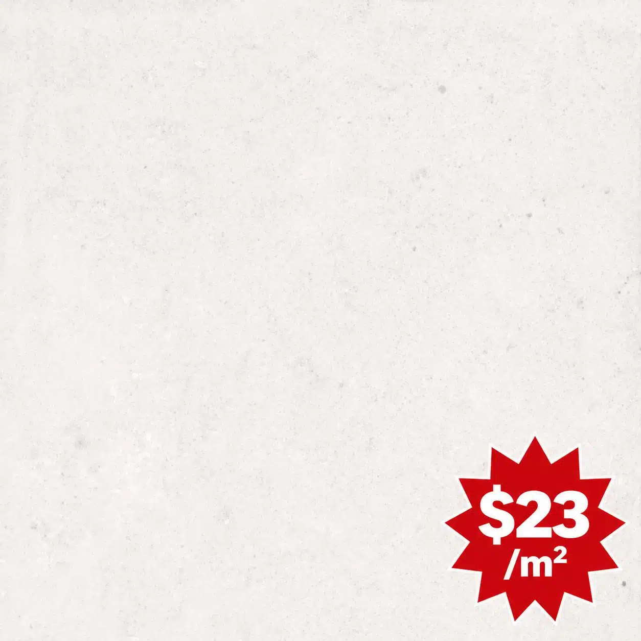
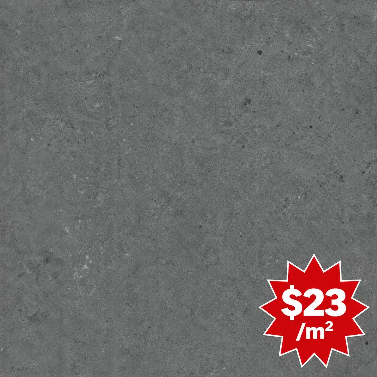
Choosing light vs dark floor tiles changes how a room feels. See Novella White and Novella Nero in the same grand staircase interior, and compare how these 600 × 600 mm matt limestone-look porcelain tiles influence light, contrast and the sense of space.
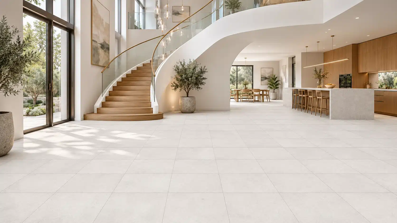
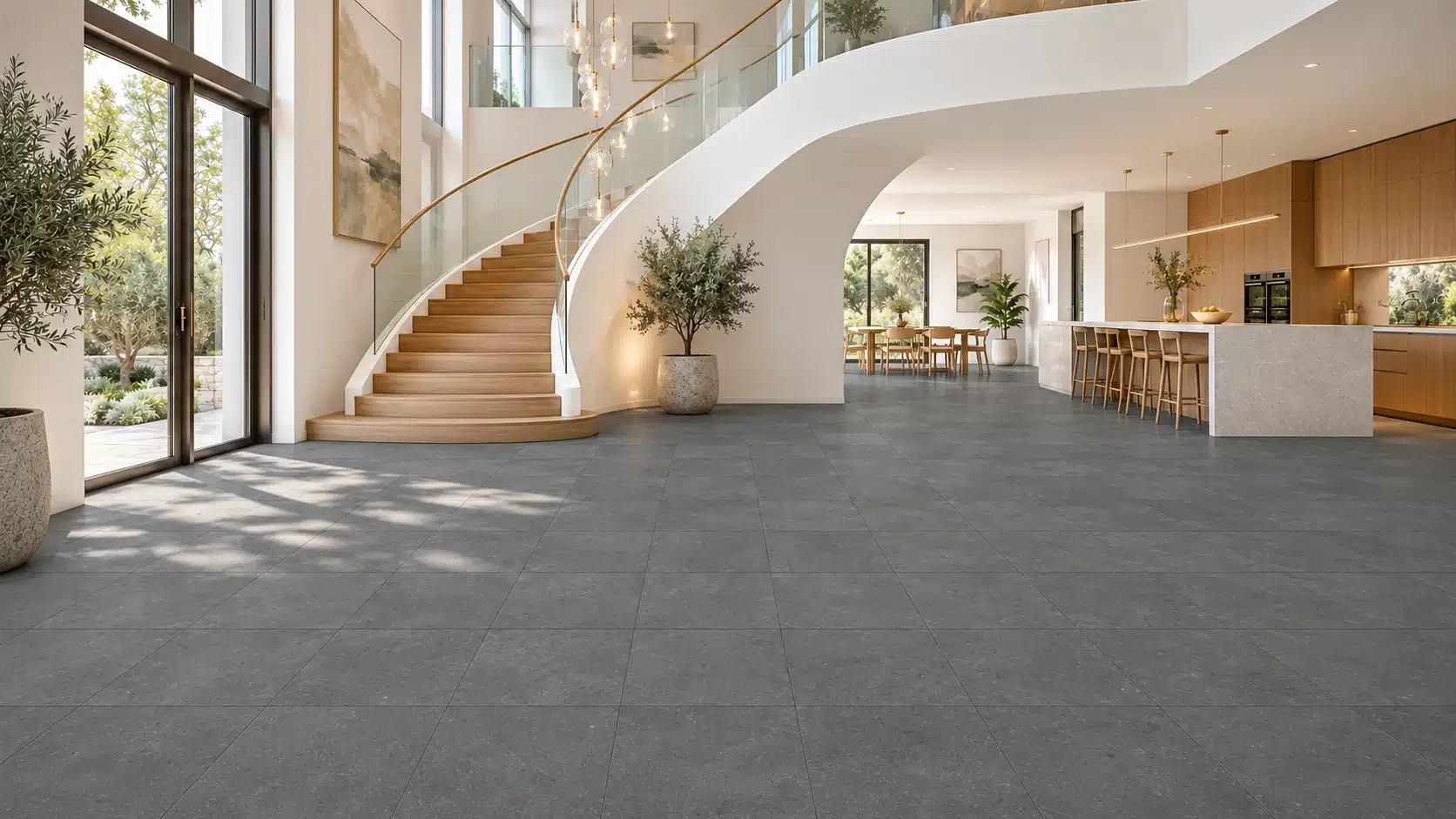
AI design visualisations based on supplier swatches. Colour, texture and tile scale are indicative; compare physical samples before selecting.
One room, two very different impressions
Change the floor colour and the architecture tells a different story. In this grand modern interior, a sweeping staircase, floor-to-ceiling windows and warm timber cabinetry create a striking setting. Novella White gives that setting a soft, airy foundation. Novella Nero introduces depth and stronger contrast.
The comparison uses the same room, a 600 × 600 mm square layout and a matt limestone-look surface. Keeping those elements consistent helps us see what colour contributes. From a design perspective, the choice comes down to the atmosphere you want and the features you want people to notice.
Novella White: light, continuity and quiet elegance
Novella White creates a gentle transition between the floor, pale walls and white curve of the staircase. With less contrast at those junctions, the surfaces read as part of a connected whole. The eye can travel across the floor and into the kitchen and dining area with fewer visual interruptions.
This gives the room an expansive, relaxed impression. The floor supports the architecture without demanding attention, allowing the timber stair treads, kitchen joinery and greenery to bring warmth and character. The limestone-look detail adds interest close up while remaining calm across a large area.
White does not have to feel clinical. Here, the soft off-white tone sits comfortably beside natural timber and warm metallic details. The matt surface gives the room a gentle, understated appearance. Daylight still plays across the surface, but without a mirror-like sheen.
Novella Nero: depth, definition and an architectural focus
Novella Nero, the dark option in this pairing, reads as charcoal grey in the supplier swatch rather than a flat jet black. Its subtle stone texture softens the colour and gives the floor variation without introducing a bold pattern.
Against that darker base, the white staircase becomes more sculptural. Its curved underside and the outline of its base are easier to pick out. The pale kitchen island also stands more distinctly against the floor, while the timber cabinetry appears warmer and more prominent by contrast.
The result feels grounded and deliberate. There is more visual weight at floor level, balanced by the bright walls, glass balustrade and tall windows above. The room takes on a more dramatic, architectural character while retaining the warmth of the timber.
Does a dark floor make the room feel smaller?
It can make the floor feel more present, but that is different from automatically making a room feel cramped. In this particular interior, generous daylight, a double-height space and pale surrounding surfaces give Nero room to work. The dark floor establishes a clear base while the windows keep the view open.
White creates a softer boundary between floor and wall; Nero makes that boundary more distinct. That difference is useful when deciding between an effortless, flowing interior and one with stronger definition. In a room with less daylight, view both samples under the lighting you will actually use, including in the evening.
Keep the finish and grout part of the decision
Both colours benefit from a simple, consistent layout. A grout colour close to the tile tone lets the floor read as a broad surface; a contrasting grout makes the square grid more noticeable. For this room, tonal grout keeps the focus on the sweeping staircase and the proportions of the space.
The matt limestone look matters as much as the colour. It brings a quieter texture to a room already rich in glass, timber and curved architecture. Choose White if you want the floor to blend into the overall palette. Choose Nero if you want it to frame the lighter elements above it.
Which look suits your home?
From a designer’s viewpoint, Novella White is the stronger choice for a soft, luminous interior where materials flow together. Novella Nero suits a more expressive interior where contrast gives the staircase, island and timber their own presence.
Bring your cabinetry, paint and benchtop samples into Bargain Factory Tile Outlet and compare both colours together. Seeing the actual tiles alongside your finishes is the best way to decide which version of the room feels right for you. A designer look starts with a considered combination—and you can put that combination together at outlet prices.
Compare Novella tile samples in our showroom →
The two Novella tiles